Path of the Paddle Association
Redesigning a nonprofit’s website into an easy-to-navigate resource for paddlers, most of them aged 50 and up.
- Client
- Path of the Paddle Association, via WEE Marketing Agency
- My role
- Website Designer & Digital Communications
- Timeline
- July – October 2025
- Scope
- Redesign and rebuild on the existing platform
- 4
- Months, from audit to relaunch
- 6
- Connected water trails to navigate
- 1,110 km
- Of wilderness trails in Northwestern Ontario
Before-and-after analytics and usability testing weren’t available, so the outcome is shown through the completed redesign.
At a glance
Challenge
Turn an aging website into an intuitive resource for an audience primarily aged 50+.
Approach
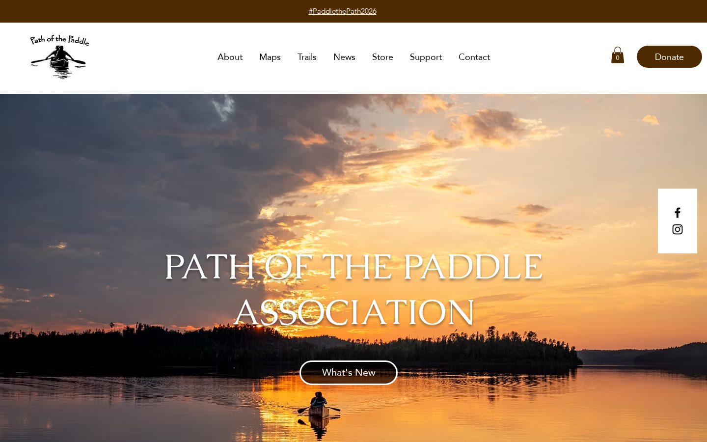
Design around the audience: simpler navigation, clearer trail pages and easier paths to maps and news.
Result
A rebuilt, refreshed site that works as the association’s main home for paddlers.
01
The challenge
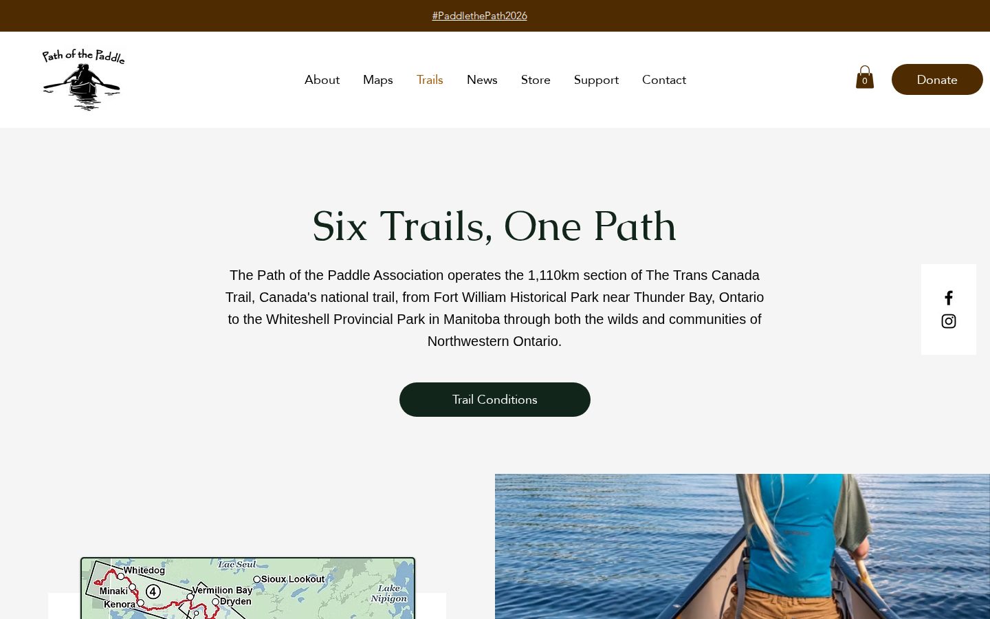
Path of the Paddle Association develops, maintains and promotes wilderness water trails across Northwestern Ontario: six connected trails, part of the Trans Canada Trail, running roughly 1,110 km from Thunder Bay to Manitoba.
The website held valuable trail information, but its structure made it harder to find than it should be. For an audience that skews 50 and over, complicated navigation creates real friction. The redesign needed to do more than look new; it needed to make information easy to find.
02
My approach
I redesigned and rebuilt the existing site on its original platform, working independently over about four months.
Design for the audience
A familiar, straightforward experience that lets visitors navigate with confidence.
Simplify the structure
Reworked navigation and information architecture for clearer paths to what matters.
Rebuild the trail pages
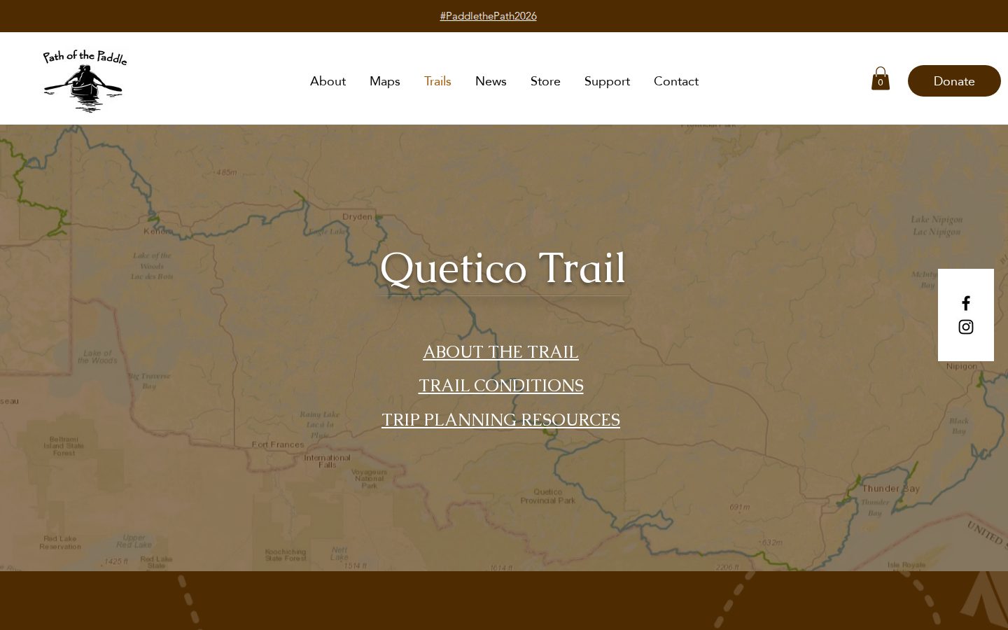
Reorganized trail information around what paddlers need when planning a trip.
Surface existing resources
Made maps and newsletter information easier to find, without rebuilding them.
Refresh the visuals
A cohesive, modern look that prioritizes clarity over decoration.
03
The outcome
A rebuilt site
A refreshed, consistent experience on the platform the association already knew.
Clearer navigation
Visitors can move easily between the homepage, trail pages and resources.
Better trail pages
Trail information structured around how paddlers plan.
Findable resources
Maps and newsletter content are now a click or two away.
04 · Takeaway
Designing for an older audience isn’t about doing less. It’s about removing every reason someone might get lost.